Day By Day: An Expression Board Game
Emotional intelligence board game aimed at developing a strong foundation
for problem-solving skills for parents and children
Day By Day is an engaging and interactive emotional intelligence board game designed to support children and their dedicated parents to cultivate a profound comprehension of emotions and feelings while equipping them with effective strategies to deal with impromptu events.
Timeline
Nov 2022 - May 2023
Team
1 Product Manager
2 UX Designers
2 UX Researchers
Tools
Figma (Prototype)
Adobe Illustrator (Visuals)
Paper Prototype
Figjam (Research)
Google Suite
Role
Sketching, Wireframing, Ideation, Iterative Prototyping, Usability Testing, Final Mock-Up
THE PROBLEM
Children lack mental health education that could reduce misconceptions and build lifelong coping skills—unlike college students who have access to various digital and institutional resources.
HOW MIGHT WE…
inform children receiving primary education about mental health in an interactive way?
RESEARCH
User Interview: Parents & Children
Recognizing that children struggle to fully express their thoughts, our team conducted interviews with both parents (35-50) and children (6-10) to understand parental concerns and expectations alongside the children's perspectives.
Physical Product Over Digital Device
[HMW] create a tangible, non-digital product that encourages and facilitates activte engagment?
Engagement & Gamification
[HMW] promote deeper understanding in challenging topics like mental health by harnessing external motivation?
The Absence of Current Resources
[HMW] create a user-friendly product that accommodates both parents and children for in-home use?
Opening Up Floor For Discussion
[HMW] help families question decisions together without fear of judgment?
Persona
We developed two user personas to illustrate the typical traits, requirements, and challenges of parents and children, as identified through our research.

Committed to fostering independence in his children by guiding them to discover their own solutions rather than solving problems for them.
"I don't want to hand them answers; I want to help them find their own way. When they solve something themselves, that confidence stays with them forever."

George James - 1st grade student, 8 years old
Wants to excel academically and receive recognition while making learning as fun and engaging as his favorite activities.
I love how my teacher at school gives me fun art stuff that teaches me about math and other things!
Solution Ideation
Assumption Mapping & Affinity Diagram
Following interviews, we organized potential solutions using affinity diagrams to identify key connections, then evaluated ideas through a desirability-feasibility-viability framework and effort-versus-impact matrix to determine project direction.

Core Elements & Features Ideation
Through ideation, we developed a physical board game with relatable storylines where players answer questions and complete activities, promoting face-to-face interaction and open conversations about feelings between children and parents.
Initiate Conversation
Express Feelings & Opinions
Connect with other players
Low Fidelity & Mid Fidelity Wireframe

Iterations
After iterating through low and mid-fidelity prototypes, we established a clear design direction and identified the key features to emphasize.
Solution 1: Initiate conversation through board game and mental health learning
Solution 2: Express feelings and opinions through situational cards and adding a specific character with communication issues rather than making the story primarily about themselves.

Solution 3: Prompting players to share their thoughts on situation cards and determine whether their suggestions would benefit the character.

Usability Testing & Feedback
To conduct testing, we noted the users' behaviors as they played through at least one full game, then asked for feedback at the end. Their critiques gave us valuable insights into what was working well in our design and what needed improvement.
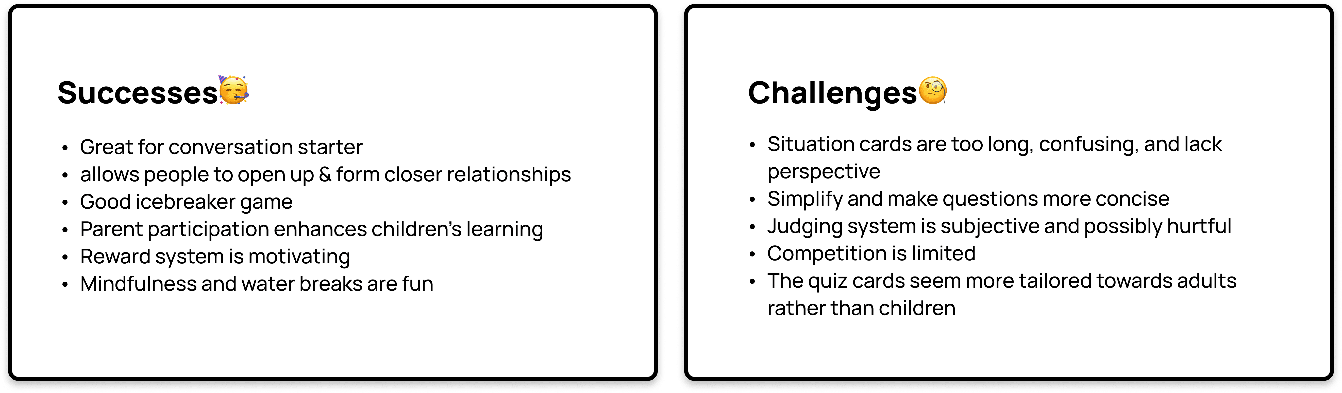
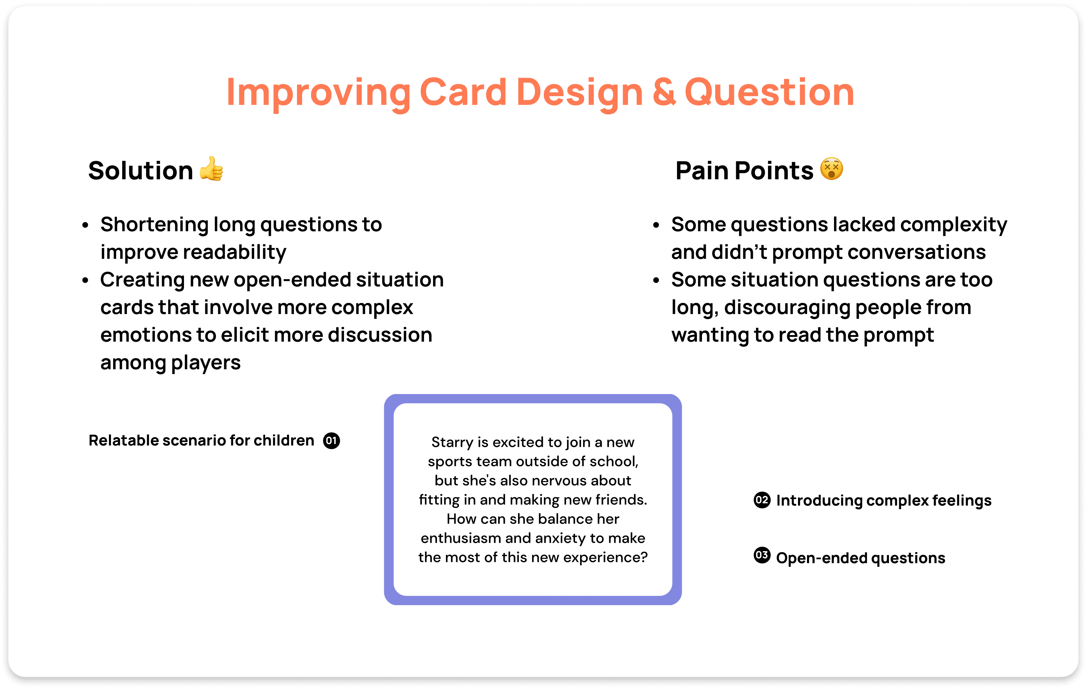
We decided to reiterate out solution based on their given feedbacks. There were two main key points that we focused on improving.

FINAL PROPOSED SOLUTION
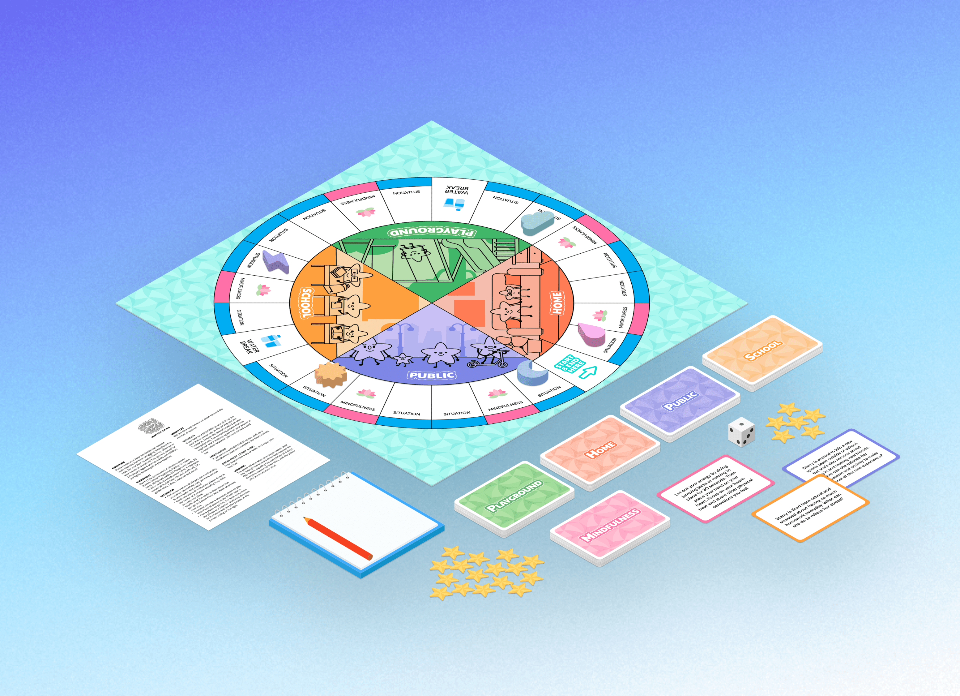
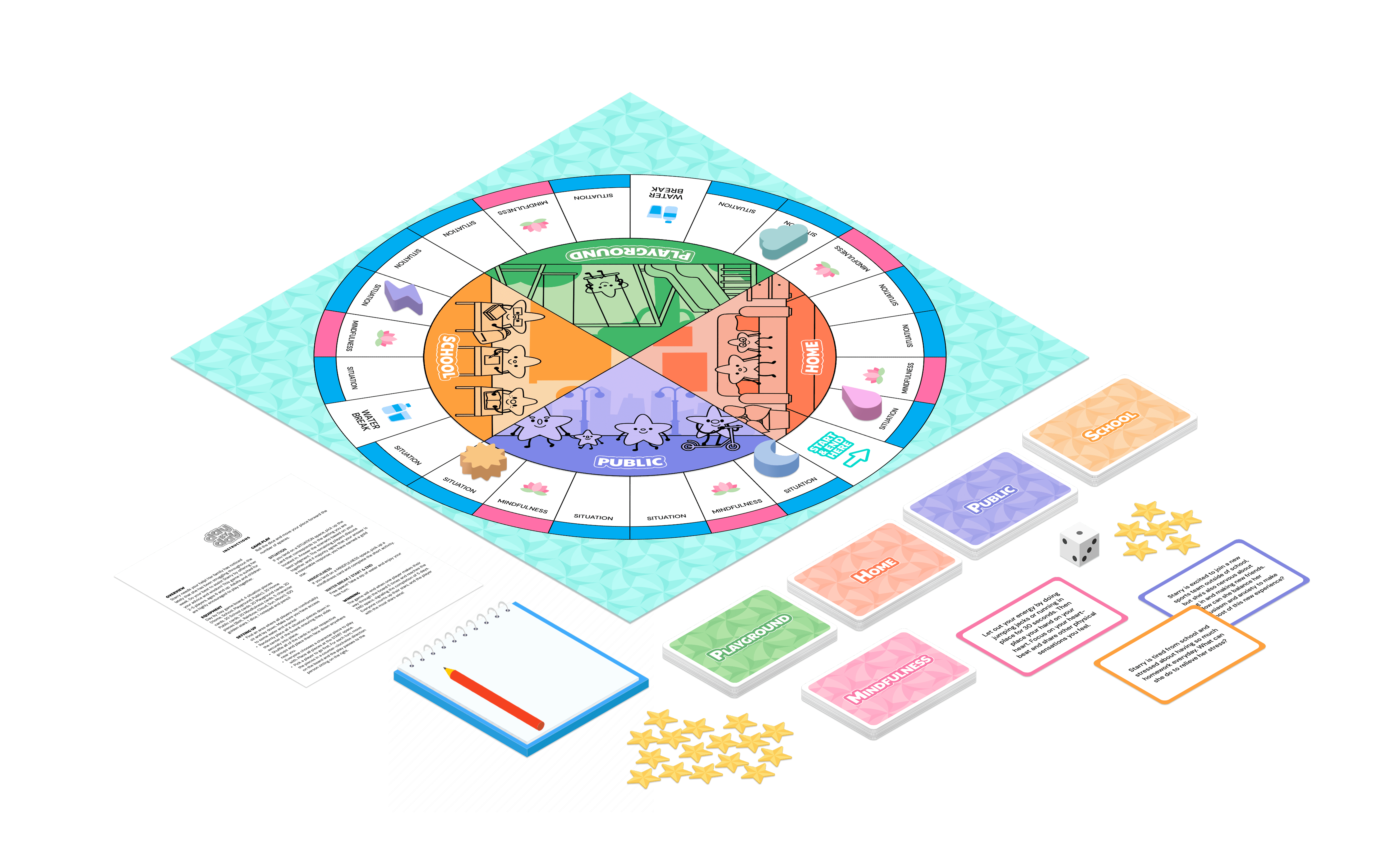
Introducting Day By Day!
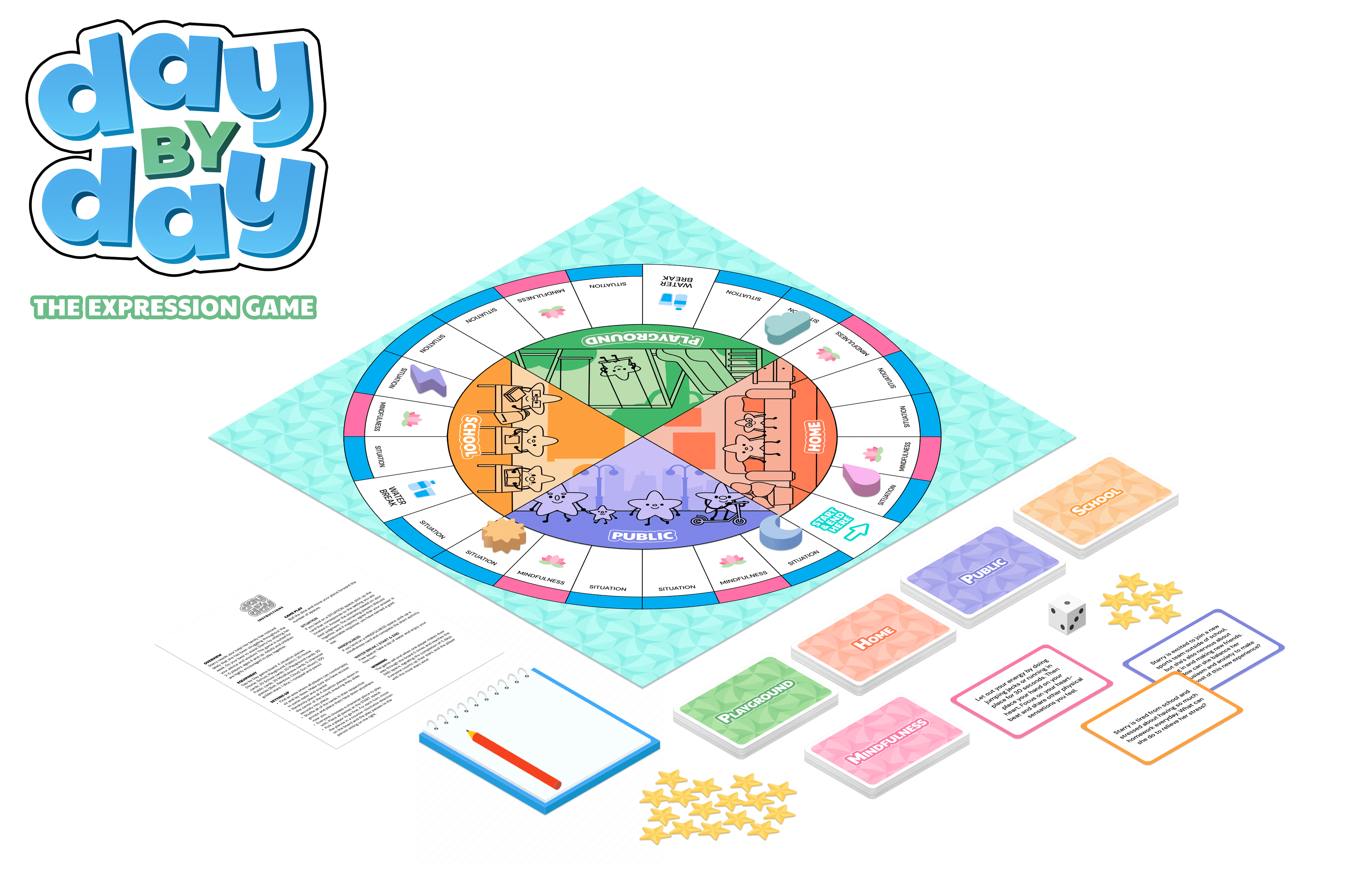
Starry needs your help! Her family has noticed lately that she has been struggling throughout the week. Do your best to assist Starry by offering her your advice and wisdom! This game is suited for 2-5 players, ages 6 and up. Adults and children are highly encouraged to play together.
LEARNINGS
Adapting to physical prototyping
Going back to the fundementals, I learned manual prototyping techniques using paper and pencil, moving away from our initial digital product assumptions when we discovered our target users had minimal interaction with digital devices.
In-person user testing challenges
Shifted from convenient virtual testing to in-person sessions with children, requiring creative testing strategies within our university environment.
Providing more settings and environments for the board game storyline
Moving forward, we hope to expand Day By Day into more schools to measure its broader impact on mental health understanding and communication skills.